For Project 1 my given material was concrete and my given word is Honest.
I’ve been exploring ways of affecting the word onto the concrete without having to use it to form the word itself.
I thought this was a really interesting way of placing the word onto the material surface in a non-permanent way. This could be great as whatever surface it is placed on could imply a different meaning.
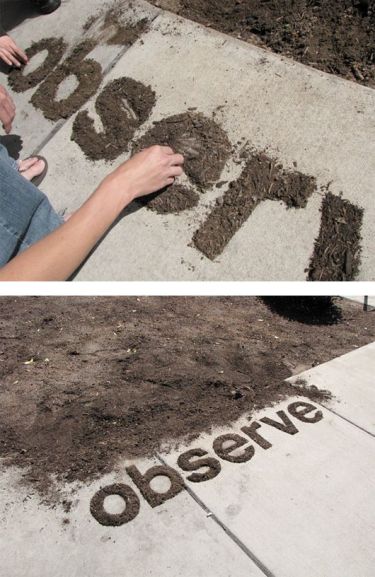
Another non-permanent way of placing a word onto concrete is using another material – in this case soil – super-imposed over the top of it. I’m not sure this would work for this project however, as it would dilute the impact of the material, rather than allowing the concrete to come across clearly as the dominant material.
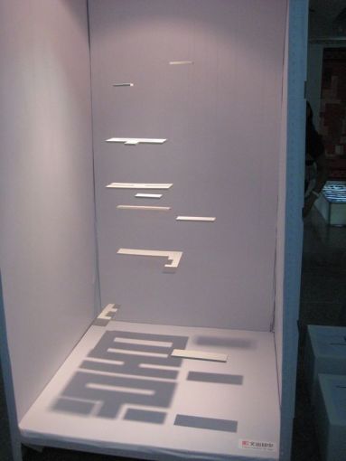
This idea is probably the closest to what I’m currently thinking. This example uses shadow created by the different shaped pieces of card suspended above to create the Kanji characters below. I’m thinking I could try something similar, maybe using a stencil to create a shadow onto concrete with the word honest on it. I need to further explore how this would relate to the meaning of the word given though.


A few different mind maps of the two given themes. The overarching connection seems to be between concrete as a metaphor for definite and substantial and honest being truth and authenticity. I could use these together as a definite truth, looking at the concrete as a way of conveying something we know as a fact; or maybe exploring the authentic nature of concrete as a material. These ideas will be developed further throughout the week.
Reference List:
‘Best Graphic Design of 2011’ 2011 [image], Best Graphic Design of 2011 in Dominic Dominguez’s Ideas Board, Pinterest, viewed 18th July 2016, https://au.pinterest.com/pin/384565255653864248/
‘Observe’ n.d. [image], Observe in Christian Notland’s Inspirasjon Board, Pinterest, viewed 18th July 2016, https://au.pinterest.com/pin/394839092303557940/
‘Shadow Type’ n.d. [image], Shadow Type in Ting Saw’s Art Board, Pinterest, viewed 18th July 2016, https://au.pinterest.com/pin/169940585914787947/


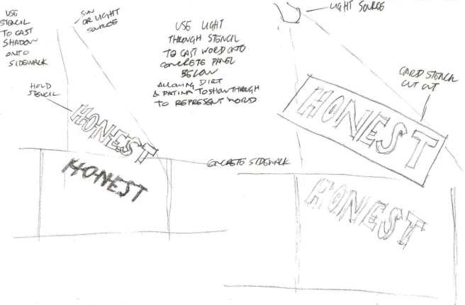 Further developing this idea, I started looking at the idea of creating a stencil out of card, which either light or shadow could be cast through to form the word on the concrete below. I’m not sure which will be the most effective; I think I may have to do some trials to see which turns out the best. I’m happy with the direction the project is taking so far though!


