Figures of Exchange

This week’s learning focused on figures of exchange. I’ve found an example to illustrate each category below:

Inversion:

Inversion Ad

Where the scale of a product is inverted. Dyer uses the example of a little person standing next to a giant version of a product (Dyer 2008, p 143). This is the most common form of inversion, even when the little person may be normal sized, made to seem smaller next to an oversized product, as above.


Hendiadys & Homology:

Hendiadys Ad.jpgHomology Ad

(Above: Hendiadys & Homology respectively)

A complex idea connected by the word ‘and’; Hendiadys features similar form but different contents, with homology being the opposite: similar contents but different form.


Asyndeton:

Asyndeton Ad

A logical disconnection; where something is missing. Here there is a logical disconnection between the stomach and the ice cream cone.


Anacoluthon:

Anacoluthon Ad - Copy

Poor or no grammatical sequence; illogical components in one image.


Chiasmus:

Chiasmus Ad

An exchange of elements, but the grammar is correct.


Antimetabole:

Antimetabole Ad

A double meaning which is incongruous or defies gravity.


Oxymoron:

Oxymoron Ad

The reverse of a paradox, where two elements remain contradictory.
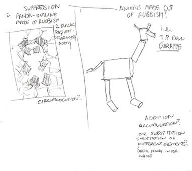
 

Project 3 Progress:

My posters are almost finished! All but one are complete, save for the additional text. My final poster is on figures of addition, so I’m trying to figure out how to tie it in to the other three posters.

Exchange Poster

This is my figures of exchange poster, which uses oxymoron. Body text which lists facts and image references are still to go on, but I’m pretty happy with how its turned out so far!


Reference List:

BBDO (n.d.), ‘You’re Not You’ [image], Adeevee – Snickers Zebra, Pinterest, viewed 1st February 2016, https://www.pinterest.com/brunopdesign/ads/

Dyer, G 2008, Advertising as Communication, Taylor and Francis, Florence

‘Ice Cream Obesity’ [image] (n.d.), Ice Cream with Big Belly, Pinterest, viewed 1st February 2016, https://www.pinterest.com/pin/407435097511196483/

Lays (n.d.), ‘Lays Potatoes Grown Closer than You May Think’ [image], Lays: Our Potatoes Are Grown Closer than You May Think, Pinterest, viewed 1st February 2016, https://www.pinterest.com/pin/528398968752500382/

Lego Support Media (n.d.), ‘Lego Cloud’ [image], Lego Cloud Advertisement, Pinterest, viewed 1st February 2016, https://www.pinterest.com/pin/272608583670885599/

McDonalds (n.d.), ‘Massive McMuffin Breakfast’ [image], McDonalds Guerilla Marketing, Pinterest, viewed 1st February 2016, https://www.pinterest.com/pin/254242341440925461/

Playland (n.d.), ‘Playland: Torture’ [image], Print ad: Playland: Torture, Pinterest, viewed 1st February 2016, https://www.pinterest.com/pin/109353097177026103/

Pepsi (n.d.), ‘Scary Halloween’ [image], Scary Halloween, Pinterest, viewed 5th February 2016, https://www.pinterest.com/pin/19703317093528914/

Sony (n.d.), ‘PS2’ [image], PS2 Ad, Pinterest, viewed 5th February 2016, https://www.pinterest.com/pin/540854236473294616/


Figures of Substitution

This week’s learning centred around figures of substitution. This can be broken down into the following categories, and I’ve found an example of each used in advertising.


Identical Substitution: An image is used to replace another; the juxtaposition provides interest.

Identical Substitution Ad

Substitution of Similar Elements: Used to compare; one element stands in for another.

Similar Elements Ad

Substitution of Different Elements: A detail or part stand in for the whole, with examples being metonymy and synecdoche respectively.

Different Elements Ad

Substitution of Opposing Elements: Paraphrasis as a roundabout way of saying something; a euphemism as an understated way of saying something and antomasia being an epithet substituted for a proper name.

Opposing Elements Ad

False Homology: Puns which are plays on words.

False Homology Ad

Project 3 Progress:

I’ve been developing ideas for my posters, and have come up with a few different concepts. The first uses animals in each poster to represent the loss of habitat resulting from anthropogenic global warming. The tagline asks viewers to interact with the scene, asking a question in each to tie all of the different images together. draft sketch 1

The second is probably my preferred option at the moment, and it involves creating animals out of different types of garbage, the idea being to discuss ways to recycle and recuse waste to reduce the impact on their habitats. Not sure what the tagline will be at the moment, but all four will use the theme of ‘garbage animals’, so to speak, to tie them together.

draft sketch 2_croppeddraft sketch 3_cropped

I’m interested in using the metaphor when creating my figures of substitution poster. I think this quote I found during my research really describes the unique position metaphors inhabit in advertising: “More interpretive effort is required in making sense of metaphors than of more literal signifiers, but this interpretive effort may be experienced as pleasurable. While metaphors may require an imaginative leap in their initial use… many metaphors become so habitually employed that they are no longer perceived as being metaphors at all.” (Chandler 2007, p 127).


Reference List:

3M (n.d.), ‘Lint Roller’ [image], 25 New Creative Advertisements, Pinterest, viewed 25th January 2016, https://www.pinterest.com/pin/182255116146822557/

Chandler, D 2007, Semiotics: The Basics, Taylor and Francis, Florence

Mcdonalds (n.d.), ‘Macca’s’ [image], Maccas- It’s Australian for McDonalds, Pinterest, viewed 25th January 2016, https://www.pinterest.com/pin/381961612126837314/

Ricola (n.d.), ‘She’s (cough) just a friend’ [image], Ricola: She’s (Cough) Just a Friend, Pinterest, viewed 25th January 2016, https://www.pinterest.com/pin/287315651203037902/

Tabasco (n.d.), ‘Grenade’ [image], Tabasco Grenade, Pinterest, viewed 25th January 2016, https://www.pinterest.com/pin/298082069066706934/

Tiket (n.d.), ‘Tiket.com’ [image], Tiket.com, Pinterest, viewed 25th January 2016, https://www.pinterest.com/pin/372672937894859114/


Figures of Suppression

This week’s learning centred on figures of suspension. I’ve included a brief description of the five different categories of suspension below:

  1. Ellipsis: An element is continually missing and becomes obvious in its absence.
  2. Circumlocution: Part of object is left out but linked to another through similarity.
  3. Suspension: Part of the message is held back, not revealed immediately.
  4. Tautology: A word is repeated but used in a different sense, its second use attracts attention in its redundancy.
  5. Preterition: When an advertisement feigns a secret.


I’ve found an example demonstrating ellipsis below:

Charity Water Ad

In this example an element is continually left out in an obvious fashion. Here, as Durand states (Durand 1987) ‘…the reader must understand that something is missing… and then guess what is missing.’ In this case, even though the text reveals this missing element, the ad still acts as a riddle the viewer will take pleasure in solving (Hoeken, et. al 2009) by looking at the images first.

 Project 3 Progress:

At the moment I’ve been doing research into other advertisements looking at global warming. I’m also hoping to get started researching the issue in depth to determine which way I want to go when producing my posters.


Reference List

Charity Water (n.d.), ‘Water Changes Everything’ [image], Water Changes Everything, Pinterest, viewed 19th January 2016, https://www.pinterest.com/explore/charity-water/

Durand, J 1987, ‘Rhetorical Figures’, in J Umiker Seobeok (ed.), Marketing and Semiotics: New Directions in the Study of Signs for Sale, De Gruyeter, ePub, pp. 295-319.

Hoeken, H, Swanepoel, P, Saal, E, & Jansen, C 2009, ‘Using Message Form to Stimulate Conversations: The Case of Tropes’, Communication Theory (10503293), vol. 19, no. 1, pp. 49-65.

Figures of Addition

This week we’ve been learning about figures of addition. This can be further categorised into five sub categories, and I’ve included a short definition of each of these below:

Repetition: Repeating the same word, sound or group of words (Dyer 2008, p 129), or visual elements.

Similarity: Similarity of form or content; their difference is used to compare like objects.

Accumulation: An image made of a build-up of different elements conveying “abundance and quantity or disorder and chaos” (Dyer 2008, p 133).

Opposition: An image with a common theme between otherwise contrasting elements, and is used to attract attention.

Double meaning, ambiguity and paradox: These “play on the opposition between appearance and reality” (Dyer 2008, p 133). In double meaning similarity conceals difference; conversely in paradox, difference “conceals a real identity or sameness” (Dyer 2008, p 133).

I’ve also been looking at project 3 this week, and have decided to go with the topic of anthropogenic global warming.

Head in Sand image

This image is an interesting take on global warming advertising, and uses the figures of addition, particularly repetition and accumulation, to create a very impactful image. Something like this could be an interesting way to approach project three for the poster using figures of addition.


Reference List:

Dyer, R 2008, Advertising as Communication, Taylor and Francis, Florence.

Rouse (n.d.), ‘The world on Climate Change’ [image], The One Picture That Perfectly Sums Up World Action on Climate Change, Pinterest, viewed 12th January 2015, https://www.pinterest.com/pin/502292164665784426/

Figures of Rhetoric

This week we have started learning about Durand’s Figures of Rhetoric, which can be categorised into four different groups:

  1. Figures of Addition
  2. Figures of Suppression
  3. Figures of Substitution
  4. Figures of Exchange

Valdman_My Masterpiece is Finished

In looking at this political cartoon, I’ve identified the forms of rhetoric which may have been used.

Figures of substitution is the main category which has been used in my opinion, predominantly substitution of similar elements, being a metaphor which allows one figure to stand in for another; in this case, it is the statue and the bulldozer standing in for Gillard’s Carbon Tax policy, and Abbott’s scrapping of it once he was elected. The black smoke coming out of the bulldozer could also represent Abbott’s reticence to acknowledge the impact of Global Warming. False homology is also used here, which uses puns as a play on words – the word ‘finished’ is given two meanings, being completed and destroyed. Figures of addition, particularly double meaning, could also be used here for the same reason.


Reference List:

Valdman n.d., ‘My Masterpiece is Finished’ [image], My Masterpiece is Finished, Pinterest, viewed 6th January 2016, https://www.pinterest.com/pin/12947917649349934/


Seeing & Knowing

Amnesty International Advertisement

(‘Amnesty International: Eyes’)

“The way we see things is affected by what we know, what we believe” (Berger 1972).

In this post I will explore how two advertisements reflect this statement, and analyse how Daniel Chandler’s concepts on Semiotics are portrayed in each example.

The advertisement for Amnesty International represents the above statement – the signifier is the image of a child’s bruised face and the text; the signified, however, reveals knowledge required to understand the advertisement as intended. The connotations are that the child has been abused; presumably by the child’s father based on the caption. If one didn’t know this the interpretation would be different; therefore this advertisement is affected by what we know.

Chandler’s concept of the Symbol/Symbolic applies to this advertisement, where the signifier doesn’t immediately represent the signified, with the exception of the connection between the two in the sign. If the text were to be placed in front of a smiling image of a child, for example, the signified would change as a result.

Lego Advertisement: Create

(Jung von Matt Hamburg, ‘Lego: Create’)

The second advertisement approaches this idea differently – the signifiers being a toy and human hand, the logo and ‘Create’. The signified reveals the advertisement’s meaning – this is dependent upon the viewer’s familiarity of Michelangelo’s ‘The Creation of Adam’. The knowledge being that a child playing with Lego acts as God of his creations. Without this knowledge, the advertisement wouldn’t be effective in capturing the experience of playing with Lego.

Michelangelo's 'The Creation of Adam'

Michelangelo’s The Creation of Adam (RasMarley 2009).

Lego Advertisement: Plane

(‘Lego: Plane’)

Chandler’s concept of Differentiation can be explored here – particularly by looking at another Lego ad. This advertisement features a different signifier and signified than the previous advertisement, but using differentiation to combine the two signs (being advertisements), we can provide meaning to them. The two ads can be seen as part of a set if we apply the signified of Lego allowing a child to use their imaginations to create. The meaning (signified) becomes more apparent if we combine the two advertisements than on their own, although the juxtaposition of the each allows them to be seen as more effective individually.

Reference List:

Amnesty International (n.d.) ‘Amnesty International: Eyes’ [image], 25 Powerful Advertisements That Will Make You Stop and Think, From Up North, viewed 12th November 2015, <http://www.fromupnorth.com/serious-advertisements-1001/&gt;

Berger, J 1972, Ways of Seeing, Ways of Seeing, viewed 12th November 2015, <http://waysofseeingwaysofseeing.com/ways-of-seeing-john-berger-5.7.pdf&gt;

Jung von Matt Hamburg (n.d.) ‘Lego: Create’ [image], 71 Brilliant, Clever and Inspirational Ads That Will Change the Way You Think, Pinterest, viewed 12th November 2015, <https://www.pinterest.com/pin/189432728054035864/&gt;

Lego (n.d.), ‘Lego: Plane’ [image], 5 Creative and Effective Minimal Print Ads, Pinterest, viewed 13th November 2015, <https://www.pinterest.com/pin/322570392039233303/&gt;

RasMarley 2009, ‘Michelangelo Buonarrati (1475-1564) – 1511c The Creation of Adam (Sistene Chapel, Vatican)’ [image], in RasMarley’s Photolist, Flickr, <https://flic.kr/p/6bAyqx&gt;

Semiotic Analysis – Opel Ad

Opel Advertisement

(McCan Erickson Frankfurt, ‘Traffic Light’)

Chandler states the three orders of signification as being denotative on the first order, meaning purely representational; connotative on the second order, which references the values attached to a sign. The third order is myth, which references culturally-accepted values that are seen as normal, or natural (Chandler 2014). We can explore these ideas in reference to the above image for the car manufacturing company Opel.

The denotations of the ad are the traffic light, the green light in particular, the paper bag and clouds; as well as the logo and text on the right side of the image.

The connotations of this ad are that the cars advertised will allow you to go fast without stopping – the absence of the red and yellow lights implies that the driver doesn’t need to worry about arbitrary road rules when in their car. The image of the traffic light with the tagline “Pure Passion” may connote that when the driver is passionate about cars, they can simply ignore other distractions and focus on the experience of driving. The tagline also implies that these cars are designed to be driven by those passionate about cars.

The myths implied in the advertisement are that car-enthusiasts are averse to road rules, and often break laws in order to pursue a purer driving experience. The other commonly accepted myth here is that a high-performance vehicle should be driven on long, open roads where the driver never has to stop.

Reference List:

Chandler D 2014, Semiotics for Beginners: Denotation, Connotation and Myth, Visual Memory, viewed 2 November 2015, http://visual-memory.co.uk/daniel/Documents/S4B/sem06.html

McCann Erickson Frankfurt, ‘Traffic Light’ [image], Opel OPC Range: “Traffic Light” Print Ad, Coloribus, viewed 5 November 2015, http://www.coloribus.com/adsarchive/prints/opel-opc-range-traffic-light-8387505/